
Contrast Paints Part 5 - Nurgle Daemons

Kris is back with another look at the Games Workshop Contrast Paint line.
In part 5 of the ongoing series he looks at some interesting ways of getting the most out of the fewest paints possible to give good variety whilst keeping up the pace for batch painting.
This feels like something of a roll back to the first one of these that I wrote.
I was putting these Ghouls back in to my display case and that is what made me think this would work as an idea.
When I wrote the first one of these articles, I was focused on getting my first impressions of the Contrast Paints across, but looking back I think I missed the opportunity to go in to some techniques I learned on that first run through that I am still using today.
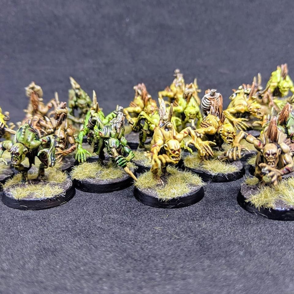
This time around I figured some nice stinky Nurgle Daemons would be a cool place to show off the techniques we will be talking about.
Knowing that that's a bit of an eclectic mix of colours but they were all done using the same contrast paint as the main colour with just a bit of variety in the preparation.
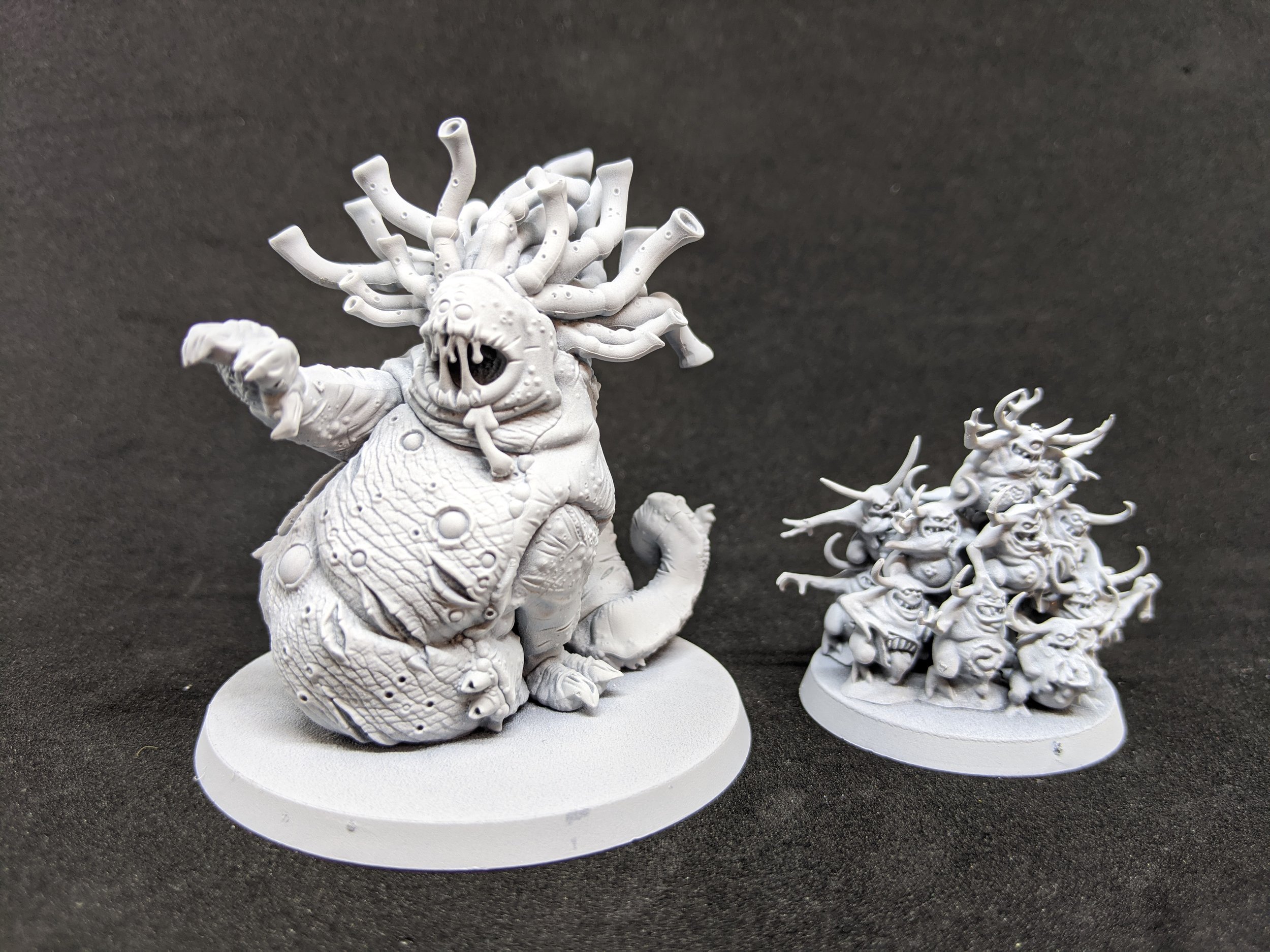
They all started from a white undercoat but then a variety of shades were used to add variety to the batches (I know, painting 6 bases of Nurglings and a Beast of Nurgle isn't a huge batch but I think it should work well to show off what I am trying to talk about :p)
If you want to paint along you need the following colours:
Corax White Undercoat
Coelia Greenshade
Reikland Fleshshade
Athonian Camoshade
Plaguebearer Flesh
Volupus Pink
Shyish Purple
Nurgles Rot
Liberal application of the shades over the top of the undercoat gives you lots of depth to play with and the white undercoat leaves a light enough area that the contrast paint will still have a lot to work with.
The thing I enjoyed the most was how quick and easy it is to get them to a level where I would be happy with them on the table.
Just picking out the details and they are good to go.
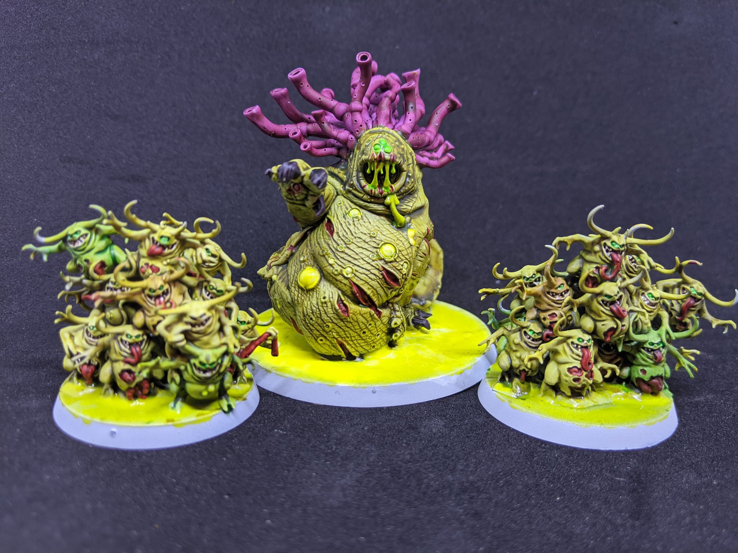
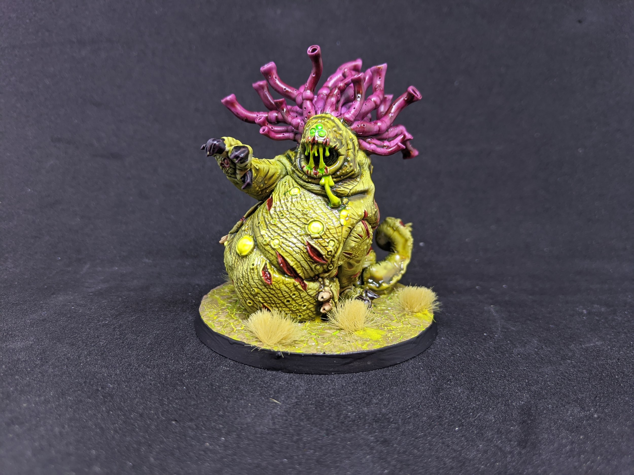
Using the same Nurgles Rot to accentuate some of the pustules, Tesseract Glow for the eyes and some extra slimy bits, Blood Angels Red Contrast for the wounds and tongues and picking out the teeth in Ushabti Bone and we are all finished!
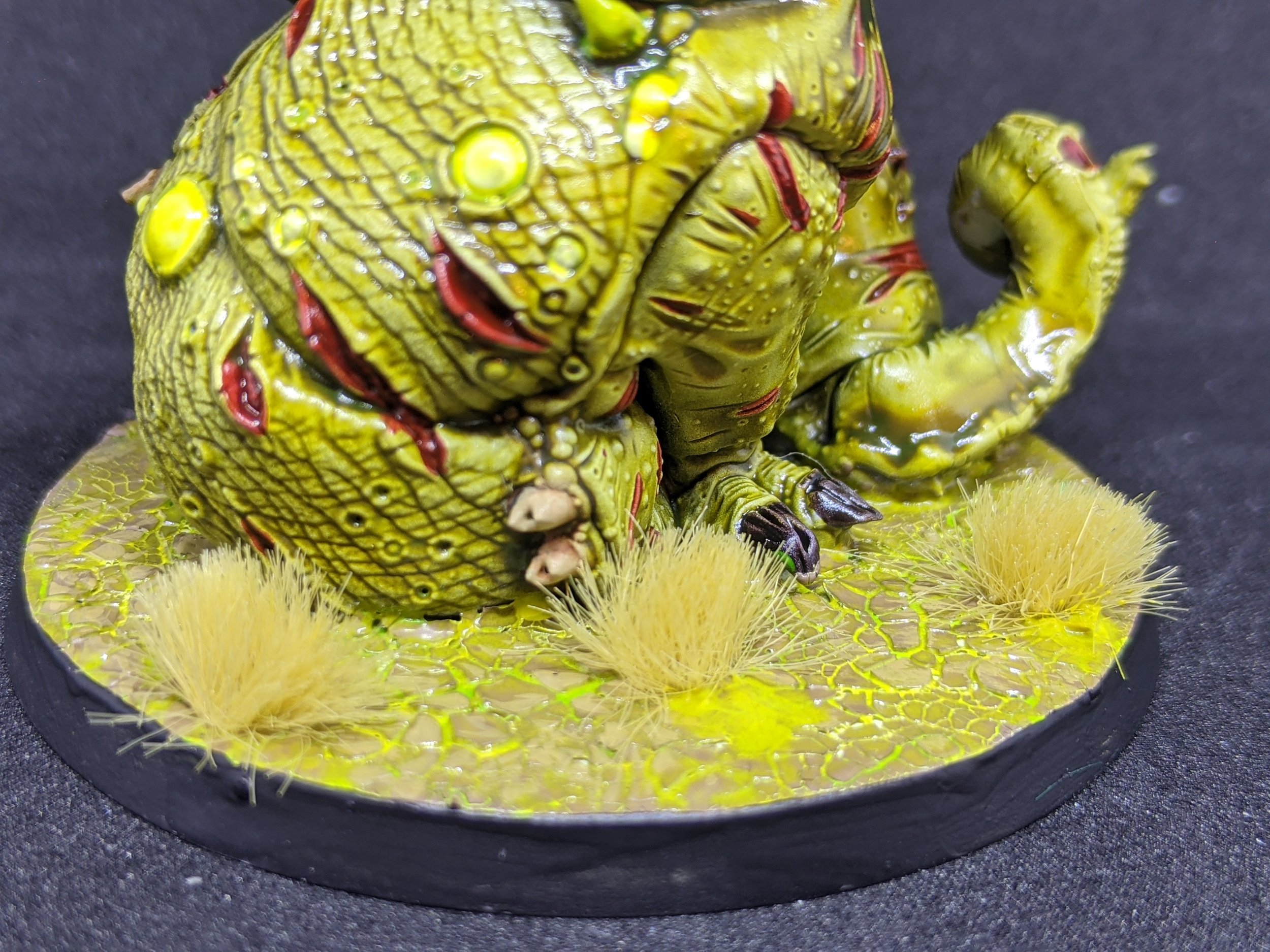
As a side bar, I have been struggling with how I was going to base this army since I ripped it off its square bases 5 years ago and it was only doing this article that gave me some time to experiment, I wanted to go for a corrupting look like the presence of the Daemons was polluting the land, but also wanted something that would be easy to (you guessed it) batch paint as I have a full army to do once I am settled on a choice.
This look was Splotches of Nurgles Rot & Tesseract Glow underneath one of the cracking textured paints that GW makes, in this case, Agrellan Earth (although, I am considering going back and trying Mordant Earth instead as I think a darker tone would look better, but let me know what you think!
...
What? I thought a short punch Painting Tutorial would be a better way to do this article, of course I can go over a couple of other things for Nurgle Daemons if you don't want the green skin tone.
Ok, but seriously, one of the down sides of batch painting, and the things I have always found the hardest is keeping it interesting, it's really easy to lose motivation if your batches are too big but you never feel like you are making real progress if your batches are too small, especially if you are playing a real Mass Battle Game like Warhammer.
I fine that I need to vary by project how many models I paint in a batch but as we are talking about Contrast Paints here, I am going to focus on a number I thinks works best for that medium given the drying times and usability of the paint once its on the Pallet (this is now heavily coloured by my time in Alberta where it is stupidly dry almost all of the time, so your experience may vary)
I would recommend Batches of between 10 and 20 models for this type of project where we are covering large areas of the models in single Shades or Contrast paints, that's over double the "normal" batch size I generally enjoy working with, which is 3-5 models at a time. I find that I can finish a batch in a session (or close to) and keep that sense of progress going, but it also does not get too tedious. The way I keep it interesting though is mixing up the batch in to smaller batches so if I am doing 20 Plaugebearers for example, I would do them all at the same time but it would be 5 with the contrast directly on to the Corax White Undercoat, 5 Coelia Greenshade, 5 Reikland Fleshshade and 5 Athonian Camoshade but as you can see all of those still give a somewhat greenish pallor to the flesh tone.
Just to mix it up we will take Grimgut the Vile from Steamforged Games' GodTear (who has a lovely Nurgly look) and using the similar techniques but with different colours.


This time we are going to use the Army Painter White Primer rather than Games Workshops' Corax White, I have found that the Army Painter Primers have a similar finish to the Contrast Primer GW recommends but as I wanted the white base, I could not use either Wraithbone or Grey Seer. Due to the amount of layers we are going to play around with to show off different hues I wanted the best of both worlds so we get the clean white and the almost glossy finish.
Then we went with Darkoath Flesh for the first coat of contrast paint (you can ignore the details if you like but its Volups Pink in the mouth, Plaguebearer Flesh on the nails and Snakebite Leather on the clothing) We did an even coat of Darkoth Flesh and cut it with Contrast Medium 50/50, on a big model like this you do not want to let it pool too much as it can spoil the effect but you can slap it on and then pull it off, or move it around before moving on to the next figure.

Now I know we said we were not going for the green look but trust me, its going to get worse but then better...
Next I wanted to start adding depth to the skin tone so we used Athonian Camoshade (I really do rate this colour by the way, everyone knows about Agraxearth Shade or Nuln Oil but this one is a winner for so many things!) I applied this directly out of the pot, but mixed up where I let it sit trying to keep as many of the raised areas clear as I could whilst getting the tint I wanted in the crevices.
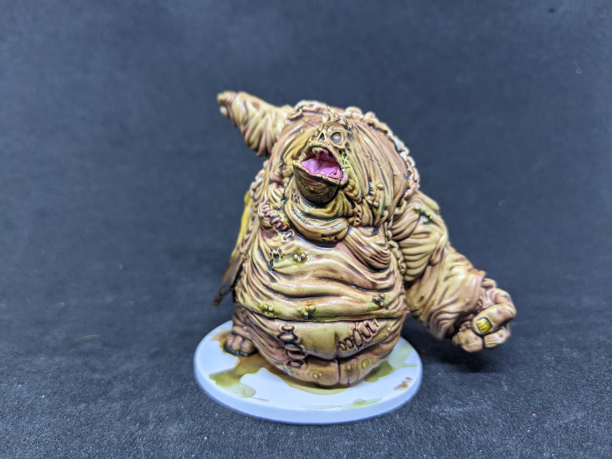
Next we used a bit of Carroburg Crimson and then Druchii Violet or try to accentuate the crevices and all the rubbing and gout and things we really don't want to have to think about...
This time I did cut the shades with some Lahmian Medium to make them easier to work with. This is actually really important to the glazing effects that we are aiming for as if you use water you can get some weird unnatural drying lines from where the shade dries, using the medium allows greater control over the shade and how it drys.
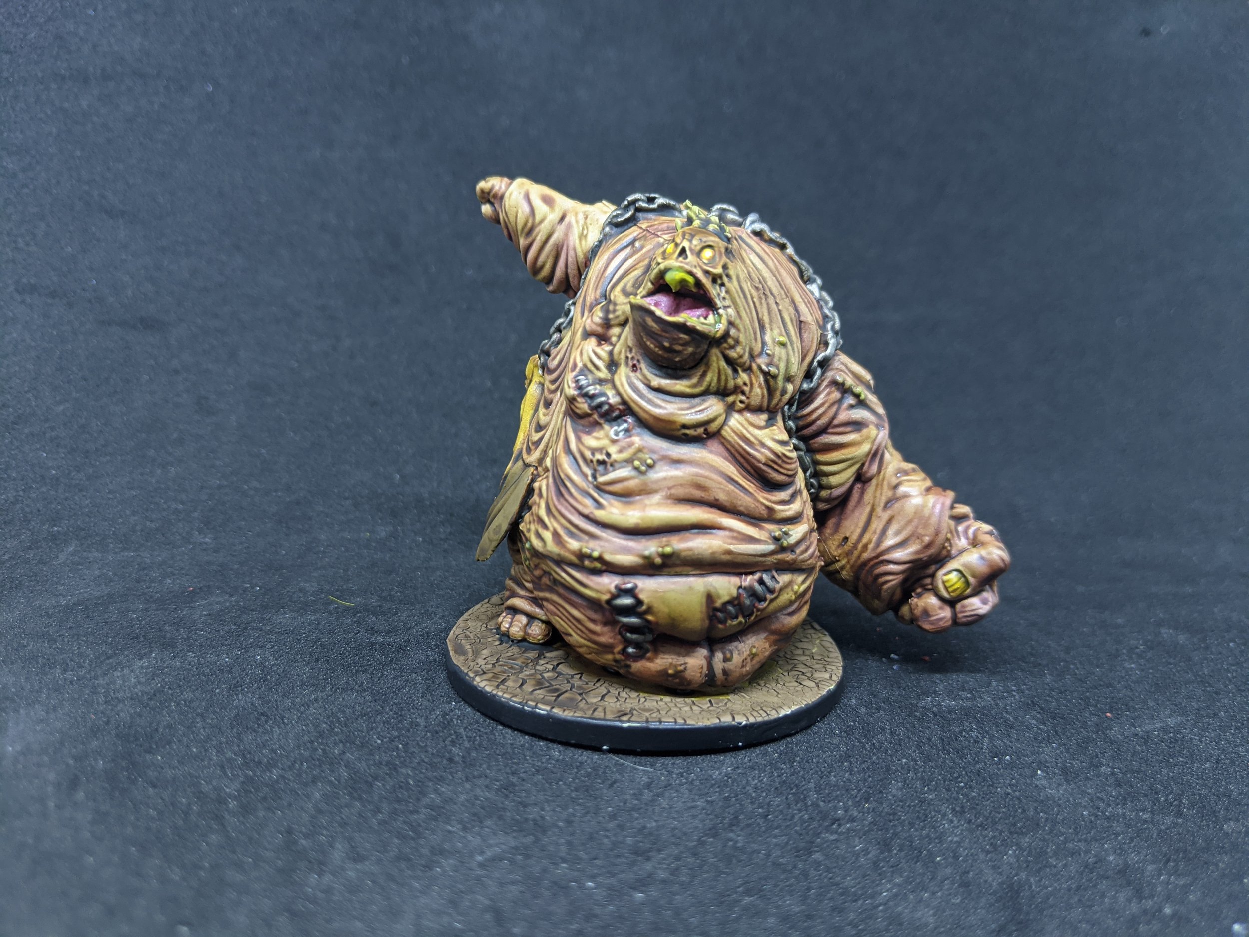
Finally we pick out the details and highlight some of the folds and flaps (again, not stuff I really want to consider too closely...) and we have an effective diseased skin tone that is not too green.
You can take both methods and interchange them at will, there is nothing stopping you from going over the greens in some purple and blue shades to add depth, or throw in some yellows, purples and browns for bruising. Whilst the second method does take a little longer due to the extra drying time for the extra layers of shading, I think it opens up a huge variety of options.
Going from Undercoat>Shade>Contrast to Undercoat>Shade>Contrast>Shade gives you an exponential amount of extra variety without really adding to your painting time within the batches and really is one of the great strengths of the Contrast Paint line, so give it a try and let me know what you think and show us some of your experiments and what you have found to add some variety to your Contrast Batch Painting!
- Kris