
Contrast Paints -Part 3: Marvel: Crisis Protocol as part of a toolbox?
In Part 3 of the Contrast Paint Review series, Kris expands his exploration into hybrid painting workflows—using Citadel Contrast Paints not just for speed, but as tools for boosting traditional techniques. The featured subject? A green giant of gamma-powered rage.
📌 Editor’s Note (2025 Update):
This article was originally drafted in 2020 but never made it to the site. It’s now been fully restored and updated with better formatting, image support, and internal links. The photos and thoughts remain authentic to that time, reflecting my early experiments with blending Games Workshop’s Contrast range into more traditional painting approaches.
📖 Start from Part 1 – First Impressions & Ghoul Speed Test
🐻 Or catch up on Part 2 – WizKids Minis & RPG Prep
🦸 Why Marvel: Crisis Protocol?
While prepping this article, I was deep into painting a full Marvel: Crisis Protocol demo set for The Sentry Box. These larger-scale figures (closer to 40mm than 28mm) provided a perfect playground to test how Contrast Paints could streamline workflows rather than define them.

The Avengers assemble – painted using Contrast Paint techniques with added highlights and detail work
Across the whole range—from OSL on Red Skull to aggressive edge highlights on Captain Marvel and Spider-Man—I was pushing to find a balance: Could Contrast help me skip boring basecoats and shading while still achieving a ‘finished’ look?

Marvel villains lineup featuring OSL on Red Skull’s Tesseract and other quick effects using Contrast Paints.
This wasn’t about speed painting anymore. It was about efficiency.
💪 Enter: The Incredible Hulk

The Hulk expansion box from Marvel: Crisis Protocol – ready for assembly and testing.
With a shelf-of-shame Hulk kit still unpainted, I decided to make this the featured project for Part 3. The model’s exaggerated musculature and scale made it ideal for testing layering, contrast-medium tweaks, and even some wild drybrushing experiments.
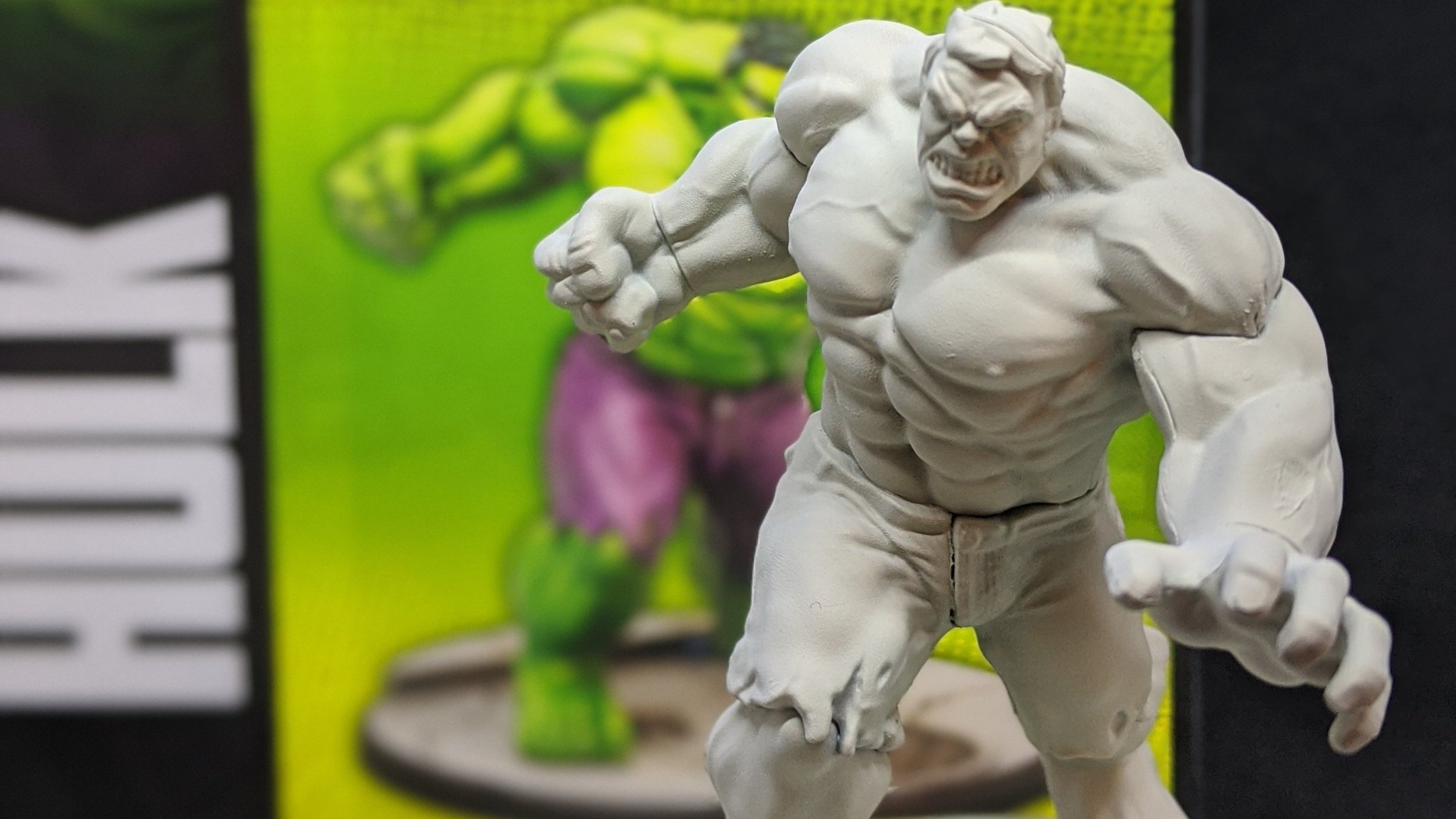
Here’s the box-fresh Hulk, straight out of packaging and cleaned up:

Assembled Hulk model before priming – ready to receive Contrast Paints and traditional techniques.
🖌️ Primer & Base Contrast Coat
I primed Hulk using Wraithbone, hoping its warmer undertone would enrich the green. Honestly? Not a huge difference—because my next move was to slap a swamp of Contrast Paint on like I was frosting a cake.
Wraithbone primer applied to Hulk for a warm-tone basecoat under the Contrast Paint layers.
I wasn’t looking for smoothness. I wanted depth in the recesses and a base I could clean up with layering. The Contrast skipped both my basecoat and wash stages and instantly pushed me into the fun part: highlights.

Hulk model after first application of Contrast Paints over Wraithbone primer. Early layering stages on skin, shorts left untouched.
🎯 Refining the Green
After the initial coat dried:
I used traditional base paint to clean up raised muscle edges.
Built up highlights using lighter greens and directional strokes following muscle fibers.
The goal? Get a comic-book look that still felt three dimensional.

Hulk in mid-layer stage with shading and definition starting to emerge across the muscles and pants.
🔥 The Drybrush Trick
Now for the bold move:
I used a large scenery brush and yellow paint to lightly drybrush the entire model.
Why? Because I wanted to:
Add brightness without re-highlighting everything
Pre-load a pop that my final green glaze would preserve

Highlighting phase using drybrush techniques to exaggerate muscle definition before final wash.
It worked surprisingly well—especially once I glazed over it with a thinned green wash that unified the tones and dialed back the chalkiness.

Near-final Hulk with completed base colors, strong OSL-inspired contrast highlights, and enhanced transitions.
👖 Pants, Hair & Details
Pants:
Purple base, aggressive highlights, then washed down with a pink Contrast mix to re-tone the cloth.Hair:
Built up from black through Incubi Darkness to grey-white. A final green glaze helped tie it to the overall palette.Base:
I wanted it grimy but green-tinged—so I worked in green-brown washes with stippling and drybrushing over textured areas.

Final result of the Hulk project—layered, highlighted, and shaded using Contrast Paints alongside traditional techniques.
⚖️ Final Verdict: Worth It?
Contrast Paints didn’t save me time in the traditional sense—but they got me to the fun parts faster. Skipping the drudgery of base coating and shading helped me maintain momentum and enthusiasm.
That psychological boost was especially helpful for the batch-painted MCP core set:
Each one benefited from a different use of Contrast—whether it was as a foundation, a glaze, or a fixer-upper for rushed details.
I think we got to a great place for a Demo Set for a Store, where you want them models to have a decent level of detail, but keeping the paint job robust enough to survive being handled by lots of pairs of hands at people give the game a try!
🔜 What’s Next in the Series?
In Part 4 – One Step Beyond, I go deeper into how Contrast fits into non-organic materials, weathering, and metallic layering. Spoiler: not everything goes to plan.
After that, Part 5 – Nurgle Daemons brings it all together on a gross green army that finally convinced me Contrast has a permanent place in my toolkit.
— Kris